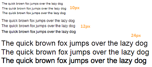
Here’s a quick font rendering sample I put together. In each set, the top is IE9’s new direct-write rendering (with subpixel positioning), the middle is standard cleartype, and the bottom is from Safari on the mac. The font is Arial, because that’s the one that seems hardest to render at small sizes.

I’d say that at 24px, the new stuff is probably better than the standard cleartype. Look at the “a” in “lazy” for example, looks a lot smoother. But at 12px, I’d say cleartype is ahead, and th safari version looks better than ie9 because of the increased contrast.
Seems like direct write attempts to solve a few problems: allow gfx cards to accelerate text rendering. Improve quality for transformed text (rotated, etc.), and enable subpixel positioning, and consistent widths across different sizes. They’ve probably succeeded at all of those, but I think the traded off quality in the common case: small text on webpages and UI’s. Is that really the right tradeoff? WPF went down this path and had to backtrack. Is that going to be the same for IE9 and the web?